Not every learner moves through training the same way. Some need more time to process instructions. Some focus better with a calmer screen. Others understand faster when the language is direct instead of buried under corporate fog. That is where neuroinclusive eLearning comes in.
At its core, neuroinclusive design reduces friction in how training is written, paced, and presented so more people can understand it and complete it successfully. In practice, that makes it a more accessible approach to eLearning design and inclusive workplace training. For HR and L&D leaders, the value is practical: when training is hard to process, people miss steps, rush through modules, or finish with only a fuzzy understanding of what they were meant to learn. The good news is that this does not require twenty versions of the same course. Usually, it comes down to better choices up front: give learners more control over pace, reduce sensory overload, and write like a human talking to another human.
What Neuroinclusive eLearning Actually Means
Neuroinclusive eLearning is training designed to work better for people with different cognitive, sensory, language, and information-processing needs. In practice, that usually means content is clearer, more predictable, less overwhelming, and easier to move through. W3C’s “Making Content Usable for People with Cognitive and Learning Disabilities” points to many of these same principles, including clear language, usable layouts, and support for memory, focus, and decision-making.
This is not about creating separate training for every learner. It is about designing learning that is easier to understand, navigate, and complete.
Why This Matters in Workplace Learning
Workplace training often creates barriers that have little to do with the content itself. W3C’s guidance on timing notes that users need enough time to complete tasks without being derailed by time limits. In training, that means forced countdowns and rushed knowledge checks can get in the way even when the content itself is clear.
There is also a strong language case here. PlainLanguage.gov defines plain language as communication people can find, understand, and use the first time they read it. That is a strong goal for workplace training, especially when audiences include employees with different literacy levels, first languages, and familiarity with company jargon.
This is also why neuroinclusive design should not be viewed as relevant only to one group of learners. Features like clearer instructions, calmer layouts, captions, and more flexible pacing often make training easier for a much wider range of people. In that sense, neuroinclusive eLearning is really about course usability in a practical, performance-focused way.
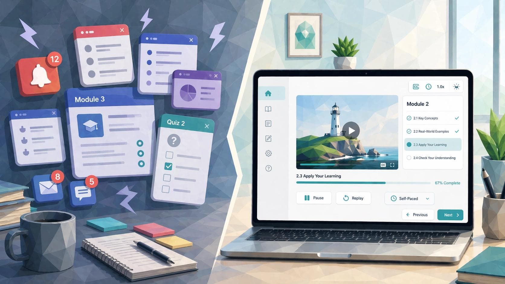
The First Building Block: Flexible Pacing
Flexible pacing is one of the most important and most overlooked parts of neuroinclusive learning design. Some learners process quickly and want to move ahead. Others need more time to read, replay, or sort through what they just saw. A course that respects those differences gives learners room to pause, revisit, and move at a manageable pace.
W3C’s timing guidance is useful here. If a user needs more time to read or complete a task, a rigid timer can become an accessibility barrier rather than a learning feature. In workplace training, that suggests a simple principle: use time pressure only when it is truly necessary to the learning goal. If you are training emergency response, timing may be part of the task. If you are explaining a new HRIS workflow, the clock does not need to act like it is auditioning for a game show.
Flexible pacing also works well with chunking. Instead of one long lesson that asks learners to absorb everything at once, divide content into short, digestible sections. One concept. One action. One decision point. Then move on. That supports attention, working memory, and comprehension.
A practical example might be annual cybersecurity training rewritten from a single 35-minute module into six short lessons. Each lesson covers one key behavior, such as spotting phishing cues or reporting a suspicious email. Learners can complete one section, pause, and come back later without losing the thread.
The Second Building Block: Sensory Options
Some eLearning experiences throw too much at learners at once: narration, animation, music, pop-ups, sidebars, and blinking prompts. Neuroinclusive design takes the opposite approach. It aims for calmer, more predictable experiences that let people focus on the content itself.
W3C’s cognitive accessibility guidance stresses clear layout and usable design patterns. In course design terms, that means fewer competing stimuli, better visual hierarchy, simpler screens, and more consistent navigation.
Sensory options also include alternatives. If a concept is presented in video, captions and transcripts should be available. If audio matters, give learners text support. If motion is used, it should have a purpose.
This is not just theory. A widely cited review by Mary Ann Gernsbacher found that video captions can improve comprehension, attention, and memory. For workplace learning, that makes captions more than an accessibility checkbox. They are also a comprehension tool.
The Third Building Block: Plain Language
If there is one upgrade most workplace training needs immediately, it is this one. Plain language does not mean childish language. It means clear, direct, usable language.
PlainLanguage.gov frames plain language around whether people can find what they need, understand it, and use it the first time they read it. That is an excellent north star for eLearning content. W3C’s cognitive accessibility guidance also recommends clear words in headings, labels, instructions, and error messages because that alone can significantly improve usability.
In course design, plain language usually means shorter sentences, more familiar words, clearer headings, less abstraction, and instructions that say exactly what the learner needs to do. It also means cutting vague phrasing and business poetry. For example, instead of saying, “Leverage the integrated escalation pathway to optimize case handoff efficiency,” say, “Use the escalation process to hand off the case quickly.” One sounds like a manager swallowed a slide deck. The other sounds like useful training.
This matters beyond readability. Research on cognitive accessibility has shown that readability, information structure, and ease of navigation affect whether users can make sense of digital content. A 2023 study on app privacy policies highlighted how readability and navigability shape whether people can understand information-heavy text. While that study was not about eLearning specifically, the lesson transfers well: dense text is not neutral. It creates barriers.
Another useful reference is WebAIM’s guidance on writing clearly and simply. It recommends familiar words, straightforward sentence structure, and avoiding unnecessary complexity. For learning professionals, that is a reminder that a course can sound polished without sounding inflated.
What Neuroinclusive eLearning Looks like in Practice
Picture a compliance course about reporting workplace incidents. In its original form, each screen contains a long paragraph, the narration autoplays, the next button appears only after a timer ends, and the quiz directions say, “Demonstrate your understanding of incident escalation protocols by selecting the most contextually aligned response.” That is technically English. Emotionally, it is a hostage situation.
Now picture the same course redesigned. Each screen covers one decision. The learner can pause and revisit sections. The narration has captions and a downloadable transcript. Instructions say, “Choose the best first step after an incident is reported.” The screen is visually clean, with one main action per page. The course is still serious. It is just easier to understand.
A second example is onboarding. Many onboarding programs overwhelm new hires with long policy decks and video-heavy modules delivered in rapid succession. A neuroinclusive version would break topics into shorter units, label sections clearly, offer searchable transcripts or summaries, and reduce decorative clutter.
A Quick Neuroinclusive eLearning Checklist
Use this quick check before publishing a course:
- Keep one main idea on each screen when possible.
- Let learners pause, replay, review, or return to earlier sections.
- Use timers only when timing is part of the learning objective.
- Write headings like signposts, not slogans.
- Use clear instructions in buttons, labels, quiz prompts, and feedback messages.
- Reduce clutter and remove elements that do not support comprehension.
- Offer captions, transcripts, or other text support for audio and video.
- Keep navigation predictable across the course.
- Test with real learners before rollout when possible.
Real-world Examples Worth Learning From
Microsoft’s workplace communication tools are one useful example. The company has highlighted how live captions and transcripts in Teams and Stream support both accessibility and productivity for employees, including those who are deaf or hard of hearing and those working in noisy environments.
Another example comes from government digital content standards. The UK Department for Education introduced a plain language standard in 2025 to help teams create clearer, more concise, and more accessible content. While that is not a corporate training case study, it still shows how large organizations are formalizing clarity as a usability practice rather than treating it as a stylistic preference.
Where Mindsmith Fits into Neuroinclusive Course Design
Neuroinclusive design does not depend on one tool, but the right authoring platform can make these principles much easier to apply. For learning teams trying to create clearer, more flexible training without dragging out production timelines, Mindsmith is a strong fit.
Mindsmith helps learning professionals draft and revise content faster, which is useful when dense material needs to be rewritten into simpler, more direct language. It also supports a more modular approach to course creation, making it easier to break training into smaller learning blocks instead of forcing everything into one long module. That aligns well with strategies discussed in Mindsmith’s posts on Cognitive Load Theory and AI-powered microlearning.
That matters because neuroinclusive eLearning starts with good design decisions, but better tools can make those decisions easier to execute consistently.
Neuroinclusive Design is Really Better Design
Neuroinclusive eLearning is not about turning every course into a special case. It is about building training that respects how differently people read, process, focus, and respond to information. Flexible pacing gives learners room to think. Sensory options reduce overload. Plain language makes content more usable, and that is the heart of accessible eLearning design.
For HR and L&D leaders, that is the opportunity. When training is easier to follow, more people can benefit from it, including neurodivergent learners, new hires, multilingual teams, busy managers, and frontline workers.
Good learning design should not make people prove they deserve clarity. It should start there.